In Ireland, smartphones dominate how people access the internet. Nearly 5.22 million individuals were using the internet in Ireland at the start of 2025, with online penetration standing at 98.9 percent. Even more striking, 95% of people in Ireland now own a smartphone, and 74% tend to use their mobile phones as soon as they wake up. With mobile traffic consistently exceeding 60% of global web visits, creating a mobile-friendly website isn’t optional. It’s the foundation of your digital presence.
Understanding Mobile-Friendly Design in 2026
Mobile-friendly website design ensures your site adapts seamlessly across devices, from smartphones to tablets and desktops. Google’s mobile-first indexing, fully rolled out by July 2024, means the search engine predominantly uses the mobile version of your website for indexing and ranking. This shift reflects user behavior. Mobile data usage in Ireland rose by 19.24% year-on-year, climbing from 445,133 terabytes in 2024 to 530,794 terabytes in 2025.
The business impact is clear. Irish businesses without mobile optimization lose visibility, traffic, and conversions. A mobile-responsive design improves user experience while aligning with search engine optimization standards that prioritize mobile performance.
Tip 1: Prioritize Mobile-First Responsive Design
The mobile-first approach starts with designing for the smallest screen, then progressively enhancing for larger displays. This methodology forces you to focus on essential content and functionality.
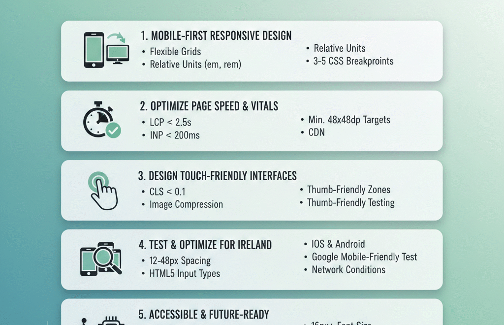
Responsive design uses flexible grids, fluid images, and CSS breakpoints to adapt layouts automatically. Responsive web design solves issues by adapting a site’s layout, content, and functionality to fit the user’s screen and device, resulting in a consistent, user-friendly experience across desktops, tablets, and phones. Unlike adaptive design, which serves separate layouts for different devices, responsive design maintains one codebase that scales proportionally.
Use relative units like percentages, em, or rem instead of fixed pixels. Embrace relative units like percentages, em, rem, or vw/vh for defining layout elements and font sizes, allowing content containers, columns, and spacing to stretch and shrink proportionally with screen size. CSS Grid handles complex two-dimensional layouts, while Flexbox manages simpler one-dimensional arrangements like navigation bars or button rows.
Implement strategic breakpoints based on your content, not arbitrary device sizes. Each web page should have a minimum of three breakpoints for mobile, tablet, and desktop, though five breakpoints provide maximum device flexibility. Test how your content behaves at different widths and adjust breakpoints where the layout naturally needs to reorganize.
Working with a web development partner who understands Irish market needs ensures your responsive design balances aesthetic appeal with technical performance across all devices popular in Ireland, from Samsung (42% market share) to Apple (38% market share).
Tip 2: Optimize Page Speed and Core Web Vitals
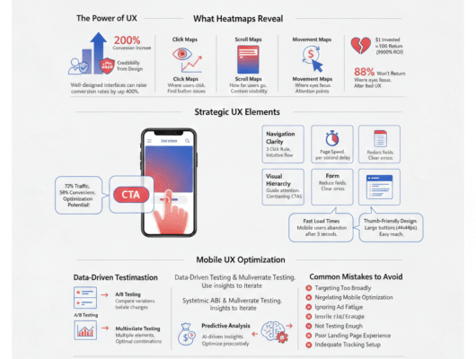
Page speed directly impacts both user experience and search rankings. Since May 2021, mobile page experience has played a vital role in search rankings, with desktop signals joining in February 2022. Irish mobile users expect instant loading. Over one-third (34%) check their phone at least 50 times a day, and 15% do so more than 100 times, creating expectations for immediate responsiveness.
Core Web Vitals measure three critical performance aspects. Largest Contentful Paint (LCP) should occur within 2.5 seconds, measuring how quickly your main content renders. Interaction to Next Paint (INP), introduced in March 2024, captures responsiveness across all interactions throughout a user’s session, unlike FID, which only measures the first interaction. INP should stay under 200 milliseconds. Cumulative Layout Shift (CLS) should remain below 0.1 to prevent annoying content shifts during page load.
Optimize images aggressively. Use modern formats like WebP or AVIF for better compression. Implement lazy loading so images outside the viewport load only when needed. Large, unoptimized images are the top reason for slow mobile pages. Resize images appropriately and use srcset attributes to serve different sizes based on screen dimensions.
Minimize JavaScript execution time. Audit JavaScript execution time in Chrome DevTools, identify long tasks, and move complex computations to Web Workers. Enable Gzip compression on your server to reduce file sizes before transmission. Implement browser caching to store static resources locally, reducing repeated downloads for returning visitors.
Consider using a Content Delivery Network (CDN) to distribute your content across multiple servers worldwide, reducing latency for Irish users. Tools like Google Ads campaigns and Facebook advertising depend on fast-loading landing pages to convert effectively.
Tip 3: Design Touch-Friendly Interfaces
Touch interaction differs fundamentally from mouse clicks. Fingertips are larger and less precise than cursor pointers, requiring different design considerations for mobile-friendly content.
Button sizing matters critically. Research shows the most comfortable button size is around 50 pixels or 10×10 mm, matching the average fingertip touch zone. Platform guidelines reinforce this. Apple suggests a minimum 44×44 points touch target, Google recommends 48×48 dp, and Microsoft advises at least 34×34 pixels with extra spacing.
Studies found users had the lowest touch accuracy on buttons less than 42 pixels, with buttons between 42 and 72 pixels achieving the highest accuracy. Primary actions like “Buy Now” or “Contact Us” should use larger targets (60-72 pixels), while secondary buttons can be slightly smaller but must remain above minimum thresholds.
Spacing prevents accidental taps. A spacing of 12 to 48 pixels is ideal between two user interface elements, preventing accidental touches and reducing frustration. This gap ensures each button feels separate and visually balanced.
Position elements within thumb-friendly zones. The bottom third of the screen is the most accessible area for one-handed use, making it the ideal spot for primary actions like navigation tabs or confirmation buttons. The center remains comfortable, while the top corners require awkward stretching, especially on larger devices.
Implement appropriate input types for forms. Use HTML5 input types like type=”tel” for phone numbers or type=”email” for email addresses to trigger the correct virtual keyboard. Minimize typing requirements by using checkboxes, radio buttons, sliders, and toggles wherever possible.
Tip 4: Test Across Devices and Optimize for Ireland
Ireland’s mobile landscape has unique characteristics. Android holds over 60% of the smartphone market in Ireland, with iPhone holding over 38%. Testing must cover both iOS and Android platforms to ensure compatibility.
Use Google’s Mobile-Friendly Test tool to verify your site meets basic requirements. The September 2025 core update reinforced mobile performance as a stronger ranking factor alongside content quality and Core Web Vitals. Google Search Console provides real-world performance data from actual visitors, showing whether pages pass Core Web Vitals assessments.
Test on actual devices, not just emulators. In 2025, the majority of households have internet access (95%), mainly fixed broadband (87%), with household internet connectivity highest for the Dublin region (97%). However, users outside major urban areas may experience different connection speeds, making performance optimization even more critical.
Monitor how your site performs across different network conditions. Connection-aware loading using service workers or adaptive loading can reduce assets when users are on 3G/4G networks. Implement progressive enhancement strategies that deliver core functionality on slower connections while adding features for faster networks.
Conduct user testing with Irish audiences to understand local preferences and behaviors. 47% of people in Ireland use their smartphones during meals, and 70% say they spend too much time on their devices, indicating constant mobile engagement throughout the day.
A comprehensive digital marketing strategy considers how mobile optimization impacts every channel, from social media marketing to local SEO visibility for Irish businesses.
Tip 5: Implement Accessible and Future-Ready Mobile Design
Accessibility ensures your mobile-friendly design works for everyone, regardless of ability. Web Content Accessibility Guidelines (WCAG) lay down web responsiveness (called Reflow) as one of the success criteria for accessible content. Accessible design isn’t just ethical; it expands your potential audience.
Ensure sufficient color contrast between text and backgrounds. Text should be readable without zooming, using a minimum font size of 16px for body text. Add descriptive alt text to all images so screen readers can convey content to visually impaired users.
Form labels must be properly associated with input fields. Provide clear error messages when validation fails, explaining exactly what needs correction. Use ARIA labels for complex interactive elements that screen readers might not interpret correctly.
Support keyboard navigation for users who can’t use touch interfaces. While designing primarily for touch, ensure all functionality remains accessible through alternative input methods. Always provide tappable alternatives to gestures, as gestures can be challenging for users with motor impairments.
Consider emerging technologies that enhance mobile experiences. AI tools are changing optimization, with 72% of companies already using AI tools for Core Web Vitals optimization. Navigation AI learns how users browse your site and preloads pages before they click, creating instant-feeling page transitions.
Progressive Web Apps (PWAs) bridge the gap between websites and native applications. They work offline, send push notifications, and load instantly from the home screen. HTTP/3 eliminates head-of-line blocking issues, with sites seeing 20-30% improvements in LCP, especially on mobile networks.
Stay informed about mobile website design templates and mobile design trends that emerge. The mobile-friendly test standards evolve as user expectations and technologies advance. Regular audits ensure your site maintains mobile-friendly design compliance.
Taking Action on Mobile Website Design
Creating a mobile-friendly website for the Irish market requires strategic planning, technical expertise, and ongoing optimization. The five tips covered, from mobile-first responsive design to accessibility and future-ready features, form the foundation for success.
Sites with consistently poor mobile metrics, like LCP over 2.5 seconds or high layout shifts, can see significant ranking drops and reduced visibility. The business cost of ignoring mobile optimization continues to grow as user expectations rise.
Start by auditing your current mobile performance using Google PageSpeed Insights and Search Console. Identify the biggest pain points, whether slow loading times, small touch targets, or poor responsive behavior. Prioritize fixes based on impact, addressing Core Web Vitals issues first.
Partner with experts who understand both technical requirements and Irish market dynamics. Whether you need support with web development, SEO optimization, or comprehensive digital marketing, choosing the right partner accelerates your mobile success.
Mobile-friendly website design isn’t a one-time project. It requires continuous monitoring, testing, and refinement as devices evolve, user behaviors shift, and search algorithms update. By following these tips for mobile-friendly website design and maintaining vigilance, Irish businesses can deliver exceptional mobile experiences that drive engagement, conversions, and growth in 2025 and beyond.